Palm NFT
2021
This two-parter put our branding skills to the test, crafting two distinct brands that coexist under the same umbrella of shared sensibilities. First came the brand identity for Palm NFT (a joint venture between crypto juggernauts ConsenSys and art services firm Heni).Then came a visual branding system for Palm—a fast, efficient, and eco-friendly blockchain technology.

01. Organic-Digital as a theme →
The Palm ecosystem is built as a breeding ground for explosive creativity.
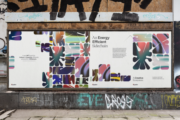
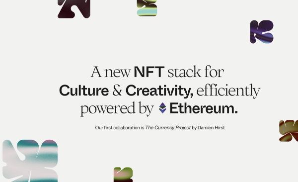
We targeted an aesthetic that could flex to a variety of themes, chief among them organic-digital; but also growth, transformation, and balance. We crafted a tech-jungle — a unique array of generated shapes that systematically create an eclectic yet refined design language.


02. The Mark →
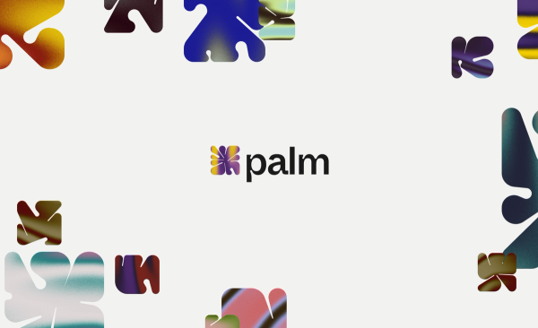
Palm’s primary brand identifier consists of two parts: an icon (made of 1 or 4 shapes) and a wordmark. The wordmark must always be used in conjunction with the icon, and is set in Whyte Rounded Inktrap — our custom font based upon Whyte Inktrap Medium.
To aid legibility, we altered the ‘Pa’ in palm to sit more comfortably together, as well as tweaked the ‘F’ and ‘T’ in ‘NFT’ to create more space.

03. The Color System →
Color is an integral part of the logo system. A core palette of neutral colors works in conjunction with a generative palette of more expressive colors.

04. Generative System →
The generative color system can shift to stretch the mood of Palm NFT’s identity (and logo) depending on provided input. While color and icon order can change, the overall logo footprint and underlying system remain intact to create variation without sacrificing consistency.

05. Two Brands Under One Umbrella →
The Palm NFT brand speaks to the prestige of art, music, sports, and film industries while the Palm brand for the actual blockchain centers the freshness of a new, exciting, and egalitarian technology.


06. Typography →
Our core typefaces of Whyte and Ortica contrast to bring an elevated, ownable sensibility to the brands.
Whyte Rounded Inktrap is our custom, modified version of Whyte Inktrap Medium, with the inktrap details rounded to give a softer, more organic feel. Combined, the type system creates a more holistic relationship with our icons and graphic shapes.


07. Digital Fabric →
The visual system features various containers, with each mark using a similar underlying textured fill that we fondly dubbed The Digital Fabric.
By feeding our program a set of images and extracting color, tone, and other values, we concocted a system capable of generating infinite static or dynamic visuals. Employing this generative visual approach helps create a more inclusive and varied experience across brand touchpoints.


08. Coda →
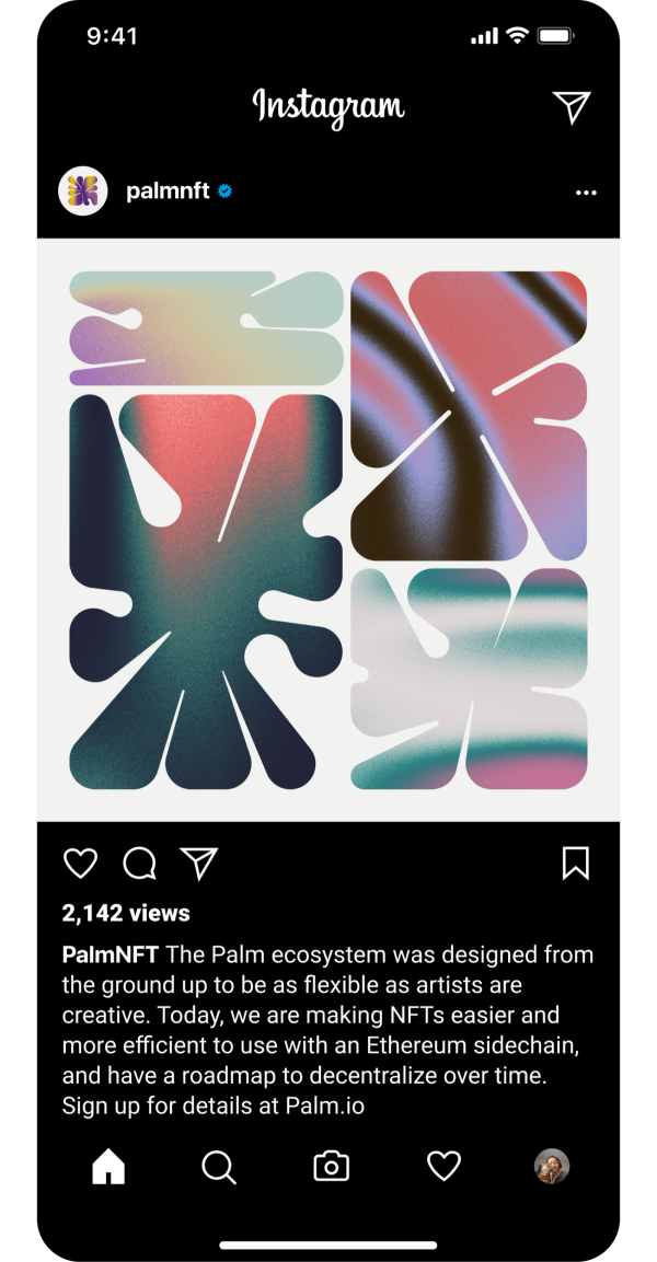
Among the many traditional deliverables, we helped Palm launch a website and a social media rollout to show off their new threads.
It’s a new frontier and our friends at Palm are helping lead the way with a more energy-efficient blockchain. Now if only they paid us in Damien Hirsts...


BUCK
Executive Creative Director
Kevin Walker
Creative Director
Camille Chu
Associate Creative Director
Liron Eldar-Ashkenazi
Shannon Jager
Vinicius Naldi
Art Director
Liron Eldar-Ashkenazi
Design Lead
Renaud Futterer
Design
Adam Brandon
Kenni Huang
Creative Strategy Director
Marla Moore
Brand Strategist
Elizabeth Vogstberger
James Moore
Creative Technologist
Donovan Keith
Michael Delaney
Tayler Johnson
Global Head of Production
Emily Rickard
